From photorealistic to watercolor, collage to oil on canvas - there’s an architectural rendering style for every project.
Some are great for pitching early concepts. Others are better for winning the final client approval.
They all serve the same purpose: to communicate your vision clearly and compellingly.
So, which one should you use for your design?
Well, that depends on your needs.
In this guide, I'll show you the most common architectural rendering styles, explain when to use them, and show some example conceptual renders to help you choose the right look for your next presentation.
Here's a quick overview:
Now, let's have a look at each style in detail.
Best for: Final presentations, marketing materials, and real estate listings

Photorealistic is the most popular 3D rendering style because it shows clients exactly what the end result will look like. In fact, most people can’t even tell them apart from real photos.
But here's the catch…
They’re notoriously hard to create. Traditional photorealistic rendering requires specialized 3D skills, high-end hardware, and hours (sometimes days) of manual work (especially for texturing and lighting the scene).
Then there's the wait. Even after the manual work is done, rendering the final image can take forever.
That’s why, for years, photorealistic renders were reserved for big-budget projects and final presentations only.
Until now.
Thanks to AI, photorealistic rendering has become available for any architect and interior designer.
AI renderers such as MyArchitectAI let you visualize any scene in less than 10 seconds without specialized skills or powerful computers.
All you have to do is upload an image of your design, describe the output with words, and click the "render" button.
You can try it for free here.

Best for: Early concepts, public boards, mood pitching
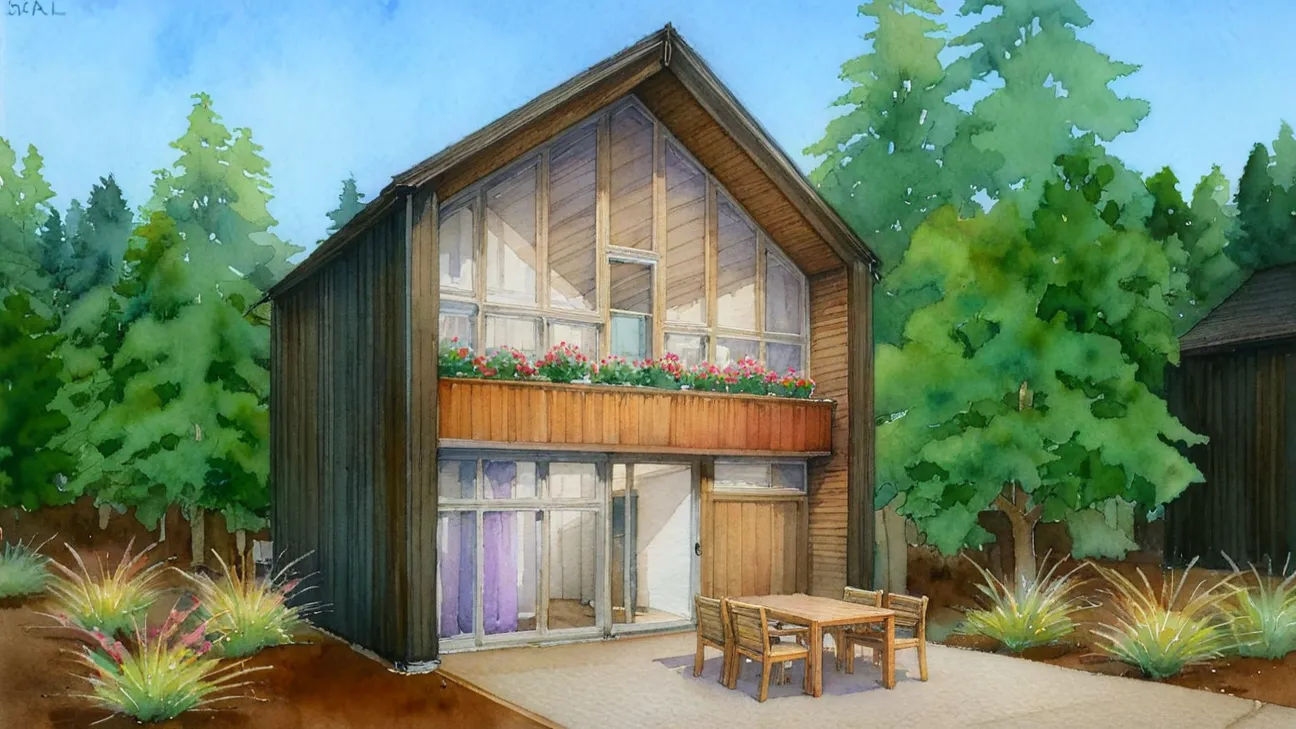
Watercolor renders are all about vibe.
They’re ideal for early-stage design when you’re pitching a concept, not locking in a final look.
Unlike photorealistic renders, they don’t create false expectations. Instead, they leave room for flexibility and creative input.
That “unfinished” aesthetic? It actually works in your favor. It makes your design feel open, human, and collaborative, which is exactly what you want during the ideation phase.
Here's how to render your concept in watercolor style.
Pro tip: Overlay a watercolor texture and use blend modes in Photoshop for a quick transformation.
Best for: Early concepts, exhibitions, artistic branding
.png)
Oil on canvas style is all about bold brushstrokes, rich textures, and that classic fine-art feel.
It’s the kind of look that grabs attention instantly, which is crucial when showcasing work at an exhibition, landing in a magazine spread, or creating a brand with a serious visual identity.
It’s especially powerful when you want to make your concepts feel timeless, expressive, or rooted in tradition, but with a modern twist.
Use oil on canvas rendering style when you want your images to stop people mid-scroll or make your portfolio feel more like a gallery.
Pro tip: Use AI style transfer tools to simulate canvas textures and brushstrokes with minimal effort.
Best for: Early design reviews, client ideation, architectural studies
.jpg)
Sketch-style renders are fast, raw, and all about the big picture.
Similar to watercolor visualizations, they’re perfect for early phases where you want to communicate a concept, not a commitment.
Think pen on trace paper, but digital. This loose, unfinished look encourages feedback and makes your ideas feel flexible and open to change.
With sketch renders, clients won’t fixate on details. They’ll engage with the vision, which is exactly what you need when the design is still evolving.
Pro tip: Use CAD exports as a base and trace over them in Procreate or Photoshop.
Best for: Editorials, design storytelling, portfolios
.jpg)
If you want your design to feel sharp, intentional, and straight out of a high-end magazine, ink illustration renders are your best bet.
Defined by strong lines and hatching, this style communicates form and structure with laser precision. There’s zero ambiguity - everything feels thought-through and deliberate.
The high-contrast aesthetic gives it an editorial vibe that’s perfect for portfolios, printed presentations, and storytelling where clarity matters.
Pro tip: Use Illustrator's Image Trace for fast conversion of linework to clean ink-style illustrations.
Best for: Storytelling, competitions, narrative visuals
.png)
Painting-style renders are your go-to when you want to add emotion to your visuals.
This style mimics hand-painted artwork through soft lighting, diffused edges, and rich, layered textures. It’s great for showing atmosphere, seasons, time of day, and the emotional impact of a space.
Use it in concept decks where you want to sell not just the layout but also the story of the design.
Pro tip: Use custom Photoshop brushes and layer masks to mimic real brush strokes.
Best for: Conceptual work, portfolios, poster-style graphics
.png)
Inspired by the iconic design movement, the Bauhaus rendering style strips away all the fluff. You get bold geometry, flat colors, and super-clean compositions, usually built around primary shapes and a minimalist aesthetic.
It’s ideal for conceptual work where you want to spotlight structure and layout without distractions. Also great for standout visuals in your portfolio, especially when you want to show off design thinking in a bold, graphic way.
Pro tip: Combine this visualization style with simple typography and lots of white space to maximize the impact.
Best for: Massing studies, zoning discussions, urban design
.png)
No textures. No distractions. Just form.
Clay and white model renders are all about showing the architecture itself, without any noise. No materials, no colors, just clean geometry bathed in soft shadows.
This style strips your design down to its essentials: volume, proportion, and structure. It’s the go-to look for massing studies, site planning, or zoning conversations where clarity matters more than polish.
By removing surface details, it forces the viewer to focus on the shape of the space: how it sits, connects, and moves.
Here's a step-by-step guide on how to turn your design into clay style.
Pro tip: Use a monochrome palette with subtle lighting to bring out depth without overpowering the form.
Best for: Concept diagrams, section cuts, early model exports
.png)
Ambient occlusion renders are the black-and-white photography of architecture. They produce a clean, minimalist look that makes your structure instantly legible.
This architectural rendering style is perfect for section cuts, exploded views, or raw model exports where you want to highlight how volumes relate without diving into materials.
It enhances clarity, boosts contrast, and keeps the focus on the architecture.
Pro tip: Use this style when transitioning from sketches to CAD models. It’s a powerful midpoint that communicates structure without overcommitting on design details.
Best for: Concept boards, presentations
.png)
Collage renders are where architecture meets visual storytelling.
This style blends real-world textures, cutout photos, 2D assets, and hand-drawn elements into a single frame. The result feels handmade, playful, and full of personality.
Collage renders are all about vibe. They're perfect for early presentations where you’re pitching a mood, not a final product.
Use it when you want your work to stand out, feel human, or break out of the typical render-polish trap.
Pro tip: Combine collage-style visuals with handwritten notes, arrows, or scanned textures to drive home the DIY aesthetic.
Best for: Early client concepts, design studies, internal reviews
Marker-style renders are fast, loose, and full of energy.
They mimic the look of hand-drawn marker sketches, which are colorful, expressive, and slightly rough around the edges.
This technique captures the spirit of brainstorming while still communicating form, layout, and intent.
Use it to say: “Here’s the concept — we’re still shaping it.”
Pro tip: Apps like MyArchitectAI and Morpholio Trace let you create marker-style renders easily.
Best for: Concept pitches, educational visuals, non-technical presentations
.png)
Cartoon-style renders are bold, playful, and impossible to ignore.
They simplify form, exaggerate proportions, and use flat shading to strip designs down to their most approachable version.
This style adds personality to your work while making complex ideas easier to understand and more fun to look at.
Pro tip: Pair cartoon renders with icons, callouts, or labels to turn your design into a clear, memorable story.
Many popular 3D renderers offer style presets that make applying the styles we discussed above a breeze.
Below is a list of available presets.
In MyArchitectAI, style presets are in the "style transfer" tab and include:
.jpg)
To use style presets in Enscape, open the "Visual Settings" window. At the top of the "Main" tab, you'll find a dropdown list with all available rendering styles, including:
.png)
Here's our full walkthrough of Enscape's settings.
Lumion's photo effects make applying different artistic styles to your concept easy. Some of them include:
.png)
Additionally, its "AI Artist Styles" feature lets you visualize your designs using unique painting styles of legendary artists, such as Monet, Kandinsky, and Picasso.
.png)
D5 Render's "AI Style Transfer" feature lets you style your renders quickly with the help of AI. Here are the available presets:
.png)
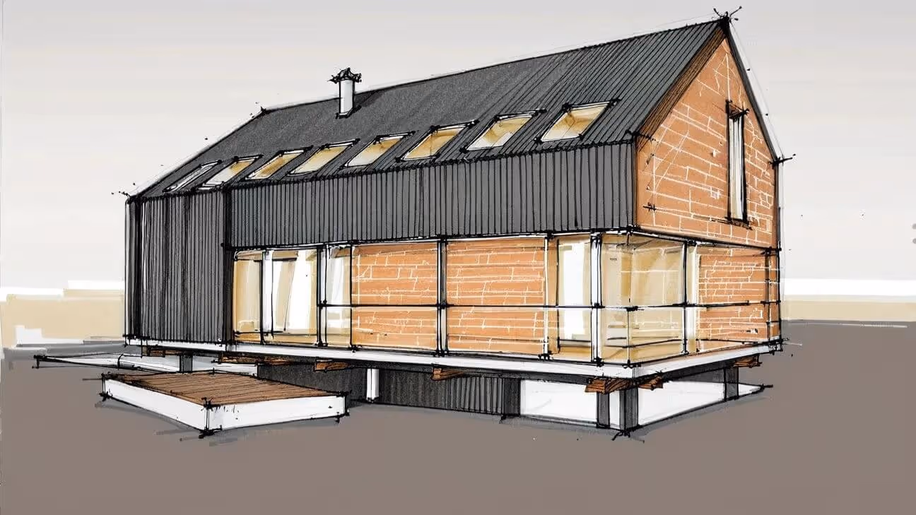
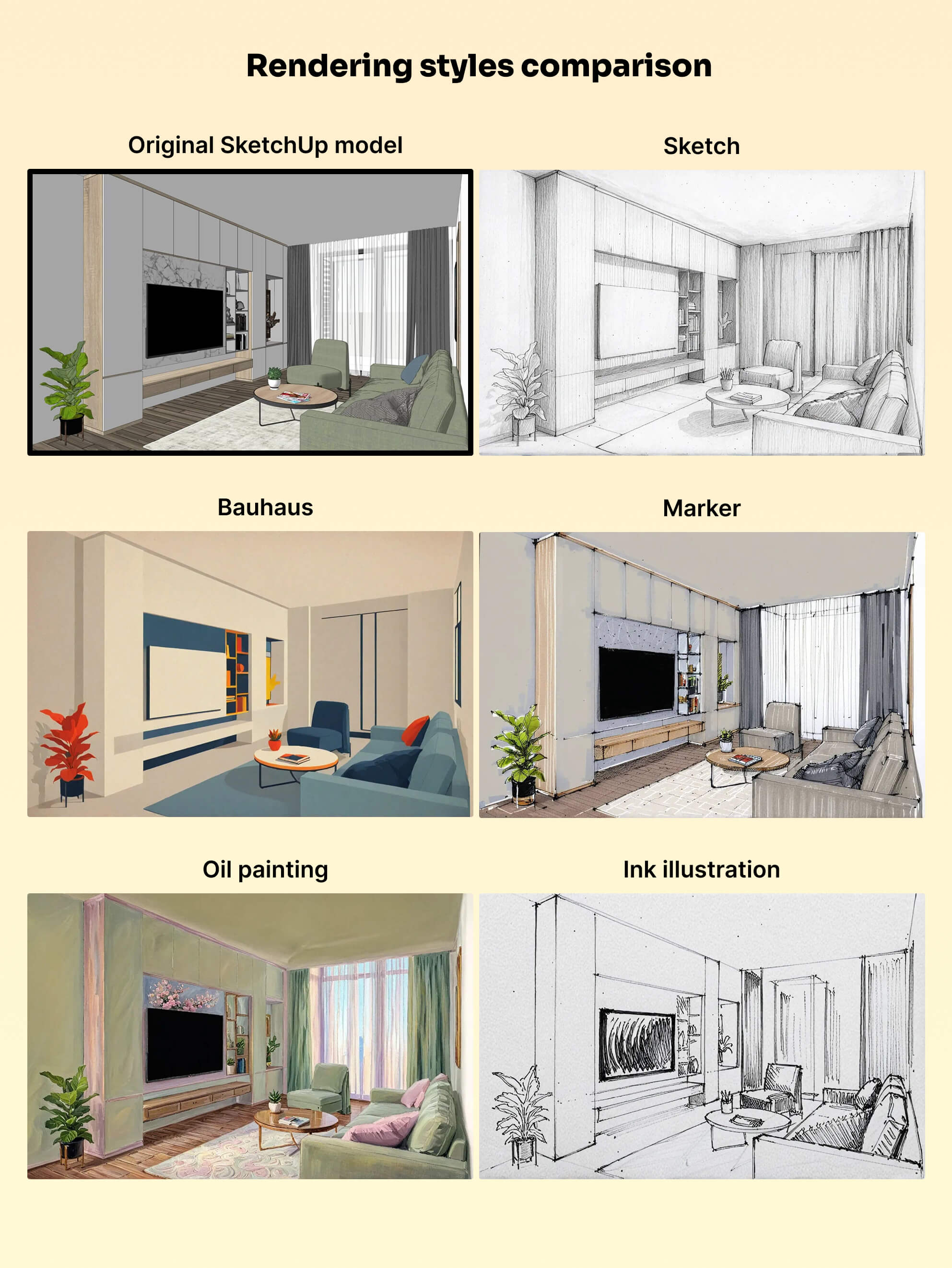
To make differences obvious, we ran the same SketchUp scene through some of the most common rendering styles using MyArchitectAI, an AI-powered rendering tool that makes the process super easy.
Choosing the right architectural rendering style isn’t just about aesthetics.
It’s a strategic decision that depends on where your project is in the design process, who you're presenting to, and what message you want to send.
Hopefully, this guide gave you clarity about the most commonly used rendering styles and when to use them.
Happy rendering!

.webp)