While photorealistic visualizations lock you into decisions early, marker renders do the exact opposite: they keep the concept loose, so clients feel invited to co-create instead of focusing on the doorknob color.
Marker renders have a warm, artistic vibe, cost next to nothing, and you can make them anywhere with just a few markers, some paper, and a flat surface.
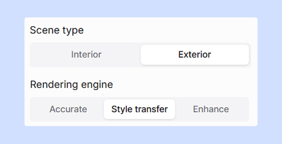
Depending on your needs, there are two marker rendering techniques:
True Black (110) – ultra-deep shadows, glazing bars, tyre treads.
Now, you're ready for some practice.
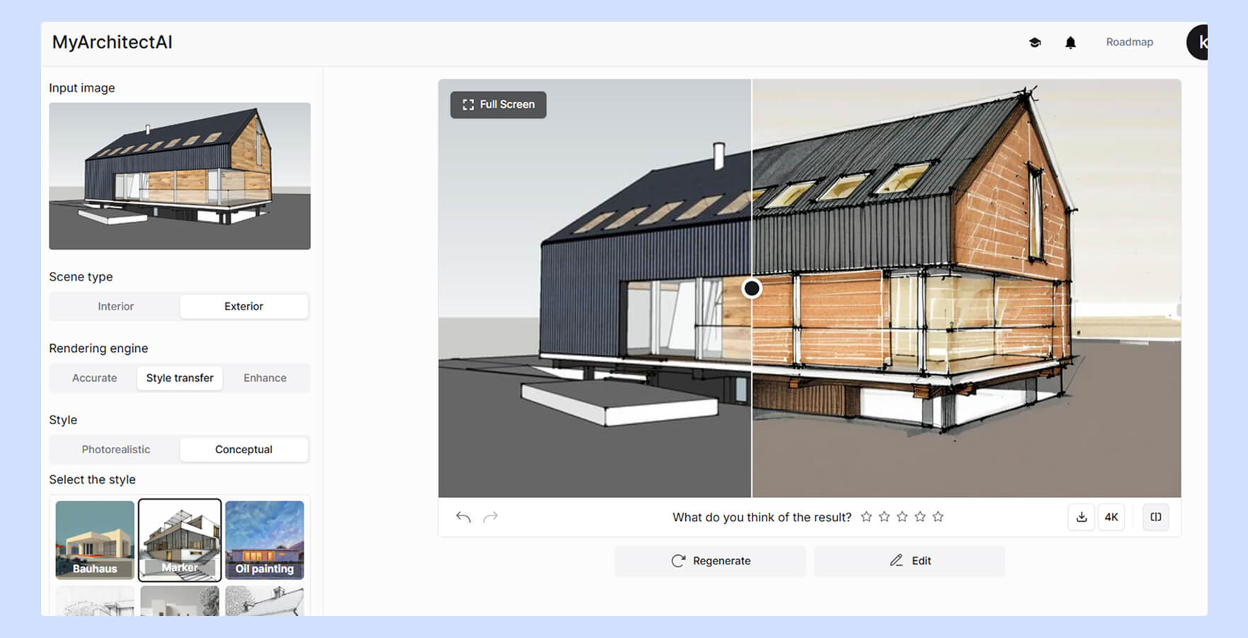
Villa Mairea – designed by Aino and Alvar Aalto
Let's start with an A3-size street-view facade marker sketch. It shouldn't take you more than 45 minutes.
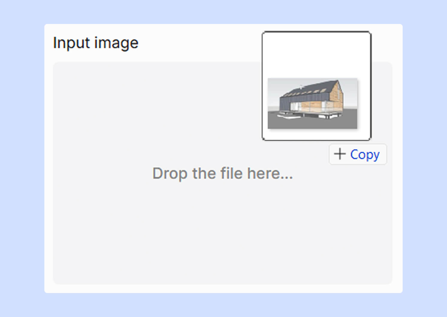
Prep. Print or plot your CAD elevation at a 1:200 scale onto your bleed-proof marker pad. With a 0.3mm pigment liner, re-ink only the most important outlines such as roof edges, window frames, and door openings.
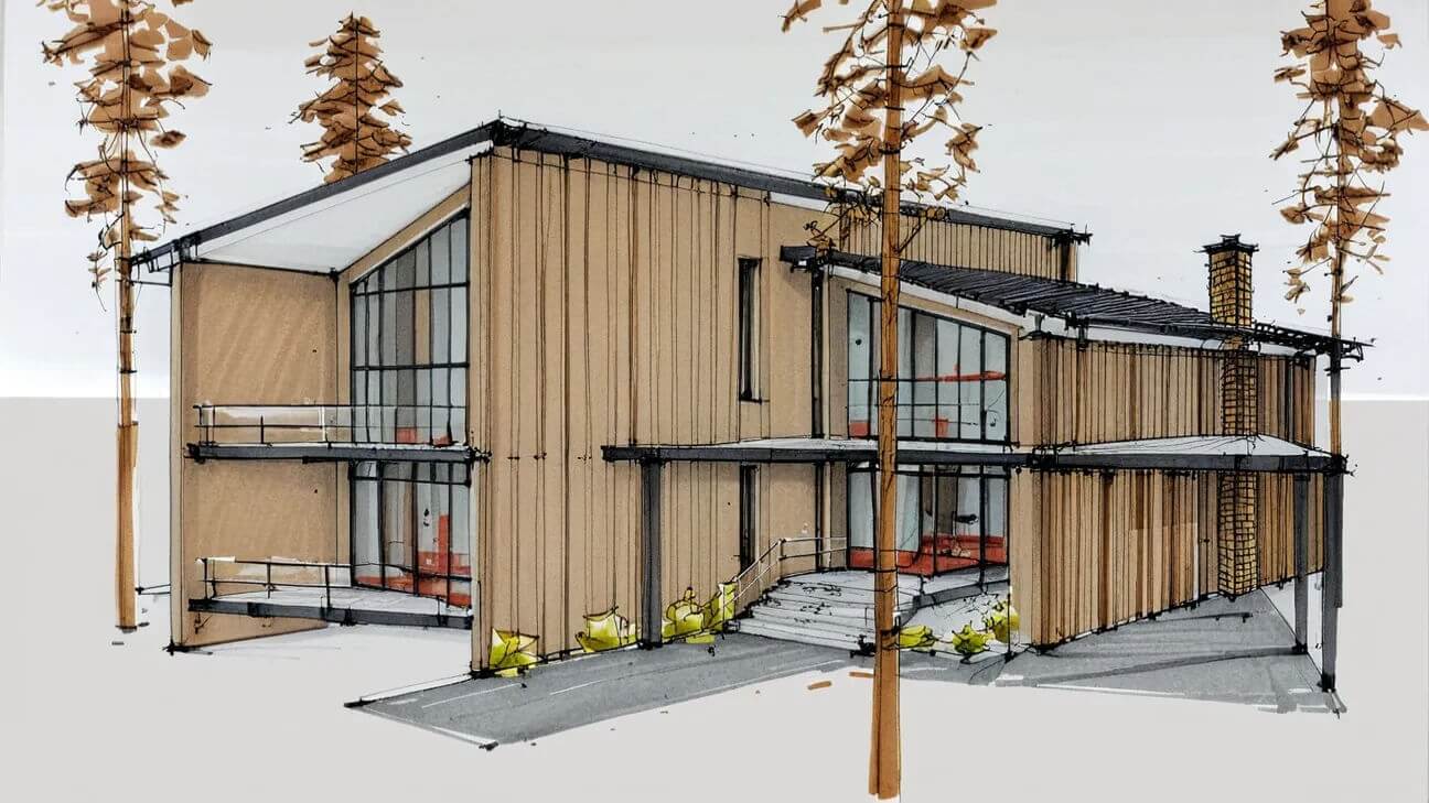
Base tones. Start with the lightest colours and cover each surface in a single, edge-to-edge pass. Use Vanilla for sunlit walls first, then Olive for shrubs and trees, and finally N2 Grey for the window glass.
Shadow map. Decide on a clear light direction (45 ° from the top-left is a safe default). Use N4 to block in soft shadows on walls that face away from the sun. Deepen the darkest cracks and recesses with N7. A single, consistent light source will help you keep the drawing readable, and the two greys are enough to give the depth without over-complicating the value structure.
Texture and accents. Hint at the material without drawing every brick. For brickwork, place short diagonal hatches with Chocolate. For foliage, tap the marker tip to create random dots. Then, reinforce edges with the liner. On glass, pull two quick vertical strokes of N2 and leave a sliver of white paper between them to give it a nice glare line look.
Highlights. Once the marker ink is completely dry, use a white gel pen to draw a crisp line on the roof edge, balcony rails, and any metal trim facing the sun. This will help make the drawing feel three-dimensional. Then, add a tiny white dot on one corner of each main window to act as a visual "glint."
Contrast. Using the True Black marker, touch only the darkest 5% of the scene: the doorway recess, the underside of an overhang, or car tyres (if any). Use a very gentle pressure so the black doesn’t bleed.
Lastly, if you need a digital version to share with clients, scan the sheet at 600 dpi in colour mode. Open it in Photoshop, and use “Perspective Warp” to straighten any camera distortion. Quickly remove dust spots with the Healing Brush and save the file as both a layered PSD and a flattened TIFF.
Common issues and pro tips
Don't expect everything to go smoothly on the first try. It doesn't happen.
Your sheet will start buckling, shadows fall flat, and markers dry out at the worst moment. Here's how to solve these problems without having to start over.
Large wall fills look streaky and patchy
Rotate the sheet until your hand moves comfortably left-to-right.
Place the chisel nib flat on the paper and pull one slow, even stroke edge-to-edge.
Overlap the next stroke by half the nib width while the previous stroke is still wet.
When you reach the halfway point, flip the sheet 180 ° and finish from the other side.
Favourite marker goes dry mid-sketch
Unscrew the broad nib with gentle pliers.
Drip two or three drops of lighter fluid or rubber-cement thinner into the barrel.
Re-insert the nib, cap the marker, and wait ten minutes before use.
Shadows feel dull
Establish a single light direction (45° from the top left is an easy default).
Lay in soft shadows with N4.
Punch the deepest recesses with N7.
Warm up mid-tones by glazing a quick pass of Warm Grey 1 (W1) once the first layer is dry.
Shadows look too dark
Take the colorless blender and start on the lighter edge of the shadow.
Pull the blender toward the darker edge in smooth, overlapping strokes.
Let each pass dry for fifteen seconds and repeat if needed.
Paper starts buckling
Tape all four corners of the sheet to a smooth board before you start.
After each colour pass, hold a hair dryer (on cool setting) about 30cm above the paper for ten seconds.
Continue coloring once the surface feels completely dry.
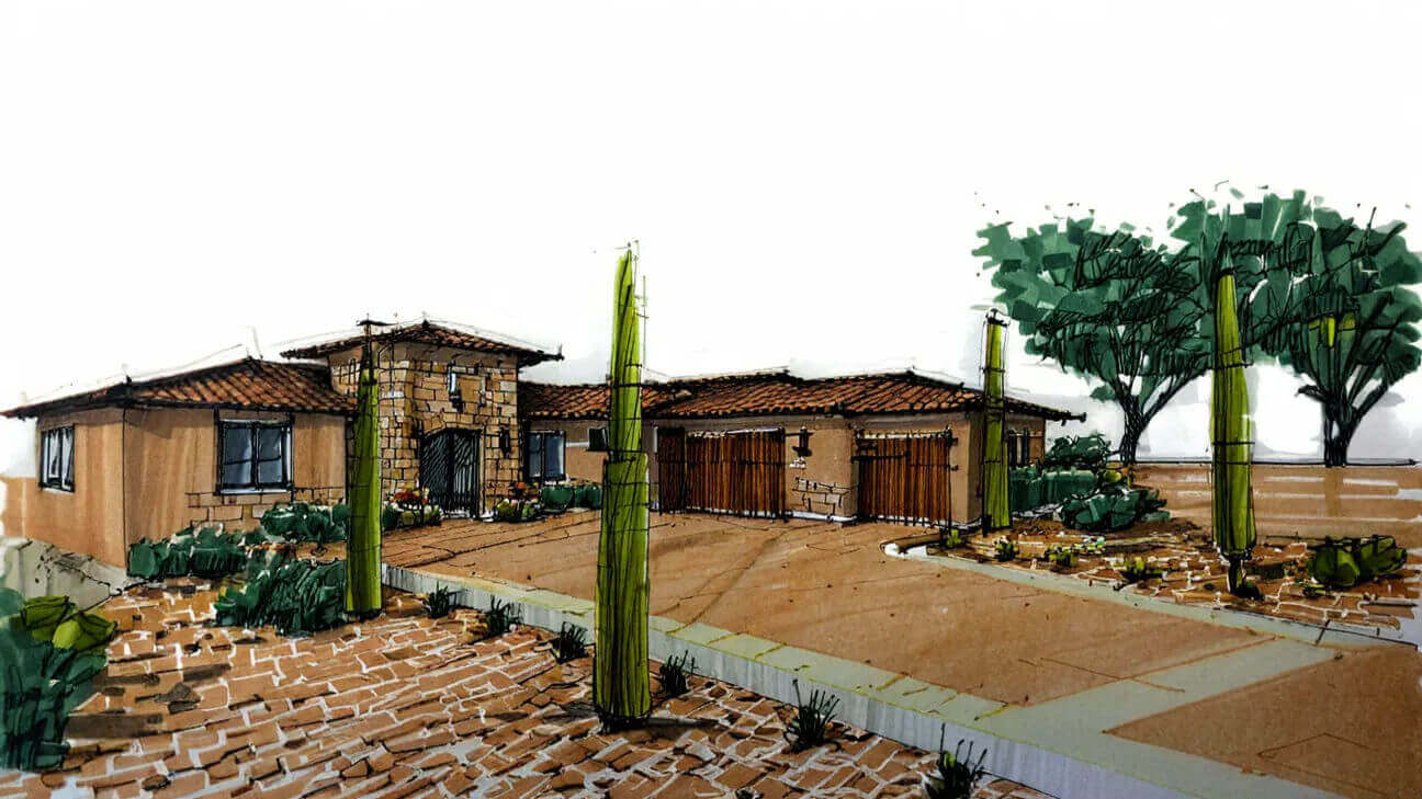
Architectural marker rendering examples
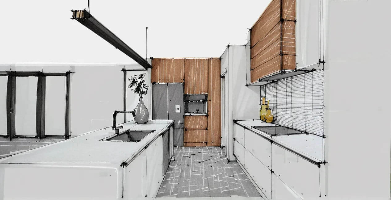
Interior design marker rendering examples
Closing thoughts
Hopefully, this quick guide gave you a good overview of the two conceptual rendering techniques and a solid understanding of which one is better for you.
In short, digital marker rendering is your go-to for rapid iterations, while hand-rendering is best when you’ve got time and want absolute control.
.jpg)
.jpg)


.webp)